Friday 9 December 2011

Construction of Advert

To create our poster we used photo shop. We started by uploading the base photo onto the background. We had to change the immage to balck and white using the black and white tool located at the side. After this we had to scale and cut the image.
Next we used the text tool to add the artists name, title, quotes and website. This was simple enough, but we had to leave space for the rating too. We used the shape tool for the rating and coppied 4 stars down.
Finally we had to import the digipak front and two company logos on to the poster.

Construction of Digipak

We used Fireworks to make our digipak and started by opening a blank document.
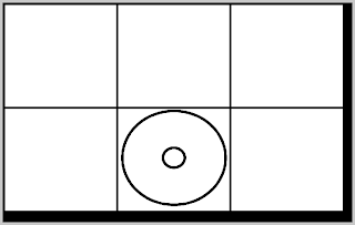
We then added the six individual pannels using the 'creat a square' tool at the  side. We spent a whileworking with the diementions to get the lined up perfectly.
After that we changes background colour and added the disk pannel so that we had our basic construction.

From there we had to add all the detail. We used the same background for each pannel and then I had to add text on top. The text tool was simple to use, but the range of fonts was an issue when it came to making the title stand out. The track list font was simple to find. Also we wanted the fonts to be different but resemble each other so we kept them the same colour. Adding pictures was also simple, but cutting them and fading them in was not.
We ended up making our digipak four pannel as we thought it looked better over all.

Filming

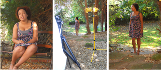
Our filming generally went well and out performer was very co-operative, this made filming very sucessful.
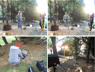
 We had some issues with certain shots because of layout of rooms, lighting ect. We added additional shots to get round this and filmed in different areas to planned. The main shot we had issues with was the mirror shot, this was due to lighting and angle. We solved this be having another shot used instead.
We spent 3 days filming in 3 different locations. We used my nans house and back garden, a public park and the school drama room. These locations all brought something different to the video. The challenges we came across through filming were; lighting, mainly considering time of day and how to carry the lights around, the other big problem was white ballance, as the light kept changing we kept having to change white ballence and ended up filming more if we forgot.

Editing

 The First thing I had to do was create a new project in Adobe Premiere Pro, I called this project 'Everything Lies'
 The preset needed to be changed to DV-PAL, widescreen 48kHz. Allowing my video to be in widescreen on youtube.
 Once I had sucessfully changed the settings I had to import my footage onto Adobe Premiere Pro. To do this I must first go to the 'file' tab at the top and then the 'import' tab from there, this brings up a screen which I found my files from.
 The individual files must be placed on the timeline at the bottom and then cut using the cutting tools at the bottom. For the conventions of a music video there must be a lot of close-ups and quick cuts so we kept to these conventions in editing. We also had to overlay our music after importing it.
The last part of our construction was changing all of the shots to black and white. This is through the effects tab at the side.

Friday 25 November 2011

Evaluation - Question 4

Evaluation - Question 3


Responses to the feedback
"I like the link with all the black and white, it gave all the pieces a link" - This positive comment allows me to see that I should keep the link as it keeps all three pieces tied together.

"I like the pictures on the poster, but I feel like it is too close to the artist and could do with being a bit further away" - The reason the picture is so close the the artist is because it is a media convention for the shots to be in close-up. Also we feel as though it connects the artist to the audience as they psychologically feel closer the the artist.  This is something we would not change.

"The digipak has all the information I need to know on it, I especially like the numbers next to the individual tracks" - This shows that we gave the target audience all the information they felt they needed to buy the digipak. The comment about the 'numbers' meaning the track times was good for us as it was something we weren't sure about, but this confirms that our choice was the right one.

"I don't like the image on the front of the digipak, it doesn't attract my attention" - The image on the front of the digipak is ment to be soft as it is representative of the music that the artist makes. The attention should be attracted because it takes up the majority of the page.

"I really like the front cover of the digipak, the picture and text really stand out" - This opposition to what was said before shows that people will have differences in opinion and thats why you must find a target audience.

"I think a few of your shots could cut quicker in your video, however I do like all the shots you use" - The slower cuts in the video are to emphasise the emotion in the song and the performance.

Evaluation - Question 2

A2 Media Evaluation 2
by: Cassii


Evaluation - Question 1


Monday 26 September 2011

Music Track


The track we have picked is 'Everything Lies' by Amanda Kaletsky. The song is meaningful but still upbeat and something teenagers can relate to. It also fits into the 'pop' category of music and when we first listened to it, the song gave us a lot of ideas.
The music has our research pointed us towards a pop style of music and to aim our music at this specific age group. The song fits into both groups we are aiming to do. We have asked for permission from the artist but have yet to recieve a response, however the music has no rights so we can still use it anyway.


Artists Permission

We found our artist on unsigned.com and from there Sophie e-mailed her to ask for permission to use her music. The music has no rights anyway as it is on unsinged.com, but we still wanted to ask to make sure. We are still awaiting a reply from the artisit.

Shooting Schedule

Tuesday 27th September - Our first day of filiming. We will try and get all of the shots dohne that we need, but may not have enough time in total. We will meet at 15:20 at college and then drive to our location with all of our equipment.

Wednesday 28th September - Our second day filming we will meet at college at 10:00 and work through the rest of the day until we get all of the shots we need.

Friday 23 September 2011

Risk Assesment.

Risk
Solution
Falling Over
Wear sensible shoes and make sure we avoid uneven terrain outside.
Falling in the pool
Make sure the pool is covered before filming and make sure we all keep clear of it.
Hypothermia
Wear layers
Illness
Make sure we all look after ourselves before shooting.
Public interference
Try to avoid prime time’s people would walk past.
Camera
Keep close to a plug socket in case batteries die.

Costume

For costume me and my partner both have very diffrent ideas. I would like to go for a natural day look with flowing skirts, light colours, flat shoes and  minimal accesories. My partner on the other hand would like to go for more of a day look with heels, dark colours, cocktail dresses and lots of accesories. This is a problem the two of us will have to deal with shortly.

The reason for my costume choice is because our video is set in the day in a quite natual environment at one point then in what we want to show as the artists house at another point. We will have to make a comprimise with costume before the date of shooting,

Performer Details

Performer: Elena Hamilton
Age: 17
Occupation: Student
Reasons for Choice: Elena is a drama student at our college so she isn't shy in front of the camera and she will be able to commit to any part we give her. Also as she goes to our college she is easy to access whenever we need her.
Possible Problems: Elena has not been in a music video before.
Solutions: Elena has been in several school musicals and knows how to perform.

Props and Equipment

The props we shall be using to decorate the room include alarm clocks and lamps. We will also be using clothes, pictures and other peices of furniture. We want to give the room a very natural realistic look and obviously for the outside there isn't a lot we can do to the location except move some potted plants round the bench and make sure the ground and bench are clear.

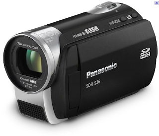
For equipment we have a panasonic sdr-s26, a tripod and lights. All of this equpment is provided by the school. We will also be using an iPod docking station and iPod touch to play the music so our performer can sing along and we have the timing. The equipment we have been given doesn't allow us to do the outdoor shots in the evening like we had previously wanted, but we easily worked round this bt just changing the time of day we planned to film.

Sunday 18 September 2011

Music Video Location Permission

Music Video Location Reece Shots

 We decided for our location it would be a good idea to use my grandmother's house as it gave us a huge option of rooms and within was the room above. This room was good for us as the neutral colours allowed us to do whatever we wanted with the room and the room is quite blank so we may decorate it as we would like to. This is our first setting, predominantly used in the first half of the music video.
In the second half of the music video we shall be moving into a small section of the garden, still at my grandmother's house. This area is quite secluded, still simple and sticks to the neutral colour scheme.

Music Video Animatic Storyboard

Music Video Treatment

Brainstorming

Friday 16 September 2011

Questionnaire

Digipak Analysis

What is a digipak?
A digipak is a patened style of CD, DVD or BD packaging. They normally are made up of six pannels but can be made of more. They tend to use paperboard or card because it is cheap and easy to mould to the shape you desire.

Digipak Analysis
Above is the digipak for band Evenescence. As you can see above the front pannel hilights the lead singer and the colours of contrasting light and dark reflect the music. This is to make a customer feel more aware of what they are buying.
The back pannel is very simplistic only giving a list of the songs on the CD and then inside are the CD and more pictures of the band. This is a very simple example of a digipak but it is also very effective with the use of colour and editing on the pictures.

Video Directors

Hype Williams is one of the best know music video directors ever and his style of a simplistic setting and mise en scene draws you to the artist. He has used this style in two of his most recent videos in the form of 'Gold Digger' by Kanye West (2009) and 'Video Phone' by Beyonce (2009). In other videos wuch as 'So Sick' by Neyo(2009) Williams has used more mise-en-scene then he normally does with props, but it still doesn't distract from the artist. This is what I am inspired by for a music video.

The styles of this video and the 'Gold Digger' video can still be compared as a lot of the same editing skills are used, but 'So Sick' has a more  natural feel to it which happens to be what my group is going for. The video contains flash backs to a past relationship and also a lot of shots in outdoor scenery. We were palying around with using these ideas in our video, but decided against the first one soon after.

From 2009 onwards Williams would say his style was a center focus on the artists body from the torso up and a coloured background and soft coloured lights in the background. This tecnique is not used in the particular video I am looking at but is something we should take into consideration when creating out video.

The Music Industry

The concentration of media ownership, also known as media consolidation or media convergence, refers to a process where pregressively fewer individuals or organisations have control of the mass media market. Through this there are 'The Big Six' in the media world, these are General Electric, Walt Disney, News Corp, Time Warner, VIACOM and CBS each revenue between $157 billion and $13 billion a year. VIACOM (revenuing $13.5billion a year) owns MTV and music game developers Harmonix, this gives them quite a large say in the  music industry.

The music industry is one of the most competitive markets. It is a bigger industry and harder to break into than others, it is built up by compositions, performances and recordings. The music industry is ran by many different people such as artists, producers, managers, songwriters, studio engineers ect.

The music market has expanded over the last couple of years with the increasing use of downloads through iTunes, this gave people a different and easier way to access music. The music industry is also under threat from piracy as most people download their music illegally.

The main music producers in the music industry are now independent labels, however the company Universal Music Group have the biggest individual share.  Sony BMG, EMI and Warner Music Group are the other 3 main contributors to the music industry. This means although for our artist these would be ideal, it wouldn't be realistic for them to get signed by them immediately. A more suitable choice for our artist would possibly a label like Cherry Tree Records. Current artists include Ellie Goulding, Far East Movement and LMFAO.  The label also used to manage Lady Gaga and Noah and The Whale before they signed with one of the main labels. Also the company is based in the USA so would be more feasible for our artist than a british label.

Wednesday 7 September 2011

Music Genres

Pop
Pop music is commercially recorded music that is often aimed at a youth market. The songs tend to be short and simple and produce new variations on existing themes. Songs tend to be a verse and repeated chorus. Songs tend to be 2 1/2 minutes long to 5 1/2 minutes long, although there are exceptions. 


Indie
Indie music, originally called independent music is a style of music where the artist is independent from major record labels, a 'Do-it yourself' approach to the industry.Indie artist have only recently started to feel commercial success with the turn of the internet. It allowed indie artists to get their music out there.


Rock
Rock music was a popular type of music in the 1960's onwards, but dates back to the 40's and 50's with 'Rock and Roll' music. Rock is particularly popular in the UK and USA. Rock music drew influence from several other genres such as jazz and classical.


Hip-Hop
Hip-Hop is a popular urban youth culture, closely associated with rap music and with the style and fashions of African-American inner-city residents. Hip-Hop is described as a form of musical expression and tends to see artists talking about their 'rough upbringing' or 'extravagant life now'.


Analysis Music Video

For the analysis of a traditional pop video I will be looking at the artist Ke$ha and her video for the song 'Take It Off'.
At the start of the video while the backing beat plays we open to a long shot of the setting this establishes where we are. The mise en scene in the scene shows that they are in a deserted setting which is a recurring theme in 'party-style' pop videos. Also the lighting through the sun in the shot provides interesting shadows and sets up that the video is in the setting of late afternoon. From this as the beat kicks in we go to close ups of certain sections of the setting. One of these that looks particularly good is the close up of the motel sign. This is something that is done with this shot as it shows the grungy party girl feel the record company want to give the artist. The motel sign is old, dirty and rusty, this is what provides the grungy feel. This helps establish who the record company are making this artist into. This is another common theme of  a pop video. Record companies like to establish a pop artist as a certain stereotype to an audience so that they can find their target audience.
The video continues to have a mid shot of our artist getting off of a motorcycle just before the singing kicks in.  In the background of this shot there the side of a curb that we can see was once painted white. The white paint on the side of the curb is coming off and fading. The artist is wearing all black with silver jewelry and an orange helmet. She is on a black motorcycle and is seen getting off. Then there is a jump cut to a close up of her walking just feet away from wear seconds before, this is done a lot in pop videos. For the first few seconds the artist is just walking and singing to camera as the camera tracks her. The camera switches between close ups and two shots of other people as well as our artist walking and jumping over cars.
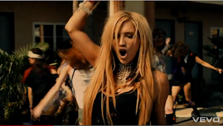
When the music speeds up the women in the video start to dance and the men start to run up the flights of stairs in the motel. As you can see at the side the artist is always central and in focus, keeping the people behind her blurry keeps the focus on the artist at all times. The artist is singing into camera and doing actions towards the camera engaging the audience the whole time. The people round her continue running and dancing round to create a lively 'party' atmosphere. This is most probably to help record sales as it would make the song more of a 'feel good' song.
       There are various flashes to the artist in a different environment through-out. She has mountains behind her and is in sand. This is to draw attention to the artist as in those shots there is nothing to detract from her. The video continues to an explosion of colour with different colour powder flying everywhere. This is possibly to add to the feel of a 'feel good' song.


For my second analysis I am looking at the video for 'Foundations' by Kate Nash. This is a good video to look at for us as it is in a bedroom and this is an idea we have been playing around with from the start of our research and planning.
    At the start of this video and through-out their are shots of objects that go to the beat. The opening has three shots of different objects that go to the three opening beats. The objects are in pairs of two such as, two toothbrushes, two watches on a table and two pairs of shoes, this goes with the theme of the video and how it's about a relationship. The last shot of the two sets of shoes is broken up by a bowling ball being thrown at it, this shows the main theme of the video in it being a 'break-up' song.
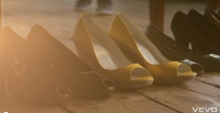
Also these shoes are worn later in the video by the artist and the one stand out colour suggest one person is more important than the other. The other images are of two toothbrushes together, and a side table with two watches, a tape and a telephone. Yet again one watch stands out as the other is just out of frame with just bits of it showing. This suggests independence and a solitary state for the artist through-out the song. After this part of the song our artist is seen playing a board game with the male in the video with her. This is a very childish look and relates to the simple style of the artist. The artist uses simple lyrics and her soft voice to present very adult ideas in a childish way. This is possibly to give less shock value to the lyrics used. Also during the game of chess the two are playing there are cuts to the artist alone singing to the camera
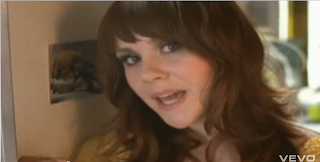
This allows the audience to feel that the artist is addressing them directly. This is used in lots of music videos as the aim of a video is to get more people to buy the song and get the music out to a broader audience. Singing to camera allows the viewer to feel as though the artist is addressing their problems and they are directly involved. A few times the artist looks down towards the floor or away from camera, this is to avoid the video being too intense because the song, although a 'break-up' song is still rather light hearted. The  light colours used for costume through the video also relate to this light hearted look and feel.
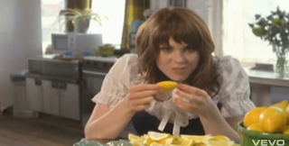
Also during the video certain lyrics such as 'you say I must eat so many lemons' and 'why don't you just have another beer then' provoke actions in the video. In 'you say I must eat so many lemons' the artist is eating lemons (right) and during 'why don't you just have another beer then' the artist is by an open fridge of beer. Also in the video the artist turns very romantic images such as a couple cuddled up on the sofa laying on each other into a very bitter and nasty image. The use of bright colour, heavy mise en scene, different sets and different types of shot make the video a good video for the individual artist. Shots include high angle, low angle, close up, extreme close up and two shot. Most of these shots are close ups.

Music Video Timeline

1920's
Oscar Fischinger, a German man created short films for music tracks and visual material  in Germany e.g. 'Komposidion in Blau' (1935)

1930's
Oscar Fischinger worked on the disney film 'Fantasia' the film was hugely backed by music with no dialogue. This was this first real sign of  music videos using animation.

1940's
The Panarom was invented. It allowed music and film to be played together, but the user couldn't select the film. The Panarom died out after the war.

1950's
Television coverage of pop music tried to attract a new teenage audience from 'American Bandstand' through 'Ready Set Go' and 'Top of the Pops'

1960's
The Scopitone was invented the machine lets the user play, skip and rewind 36 short colour films. Around 1000 machines were installed before dying out in the mid 60's because of television.

1970's
In the 70's 'serious rock' gained places on television such as 'The Old Grey Whistle Test'. Promo clips became massively popular with bands these gained airplay on television.

1980's
MTV began broadcasting on the Warner satellite. Viacom bought MTV, a major media conglomerate. Later launching MTV in Europe lead to a swift acceleration in views and subscribers. By the end of the 80's it was vital to have a music video for a successful record.

1990's
Hype Williams lead the way for black artists in the music industry producing videos for people such as TLC, Missy Elliot and R.Kelly. By the late 90's he was commanding budgets of $2million. His work generated high record sales in return.

Preliminary Task


For our AS Media preliminary task we were asked to recreate Britney Spears music video for the song 'Hit Me Baby One More Time'. We had to recreate the first 1 minute and 20 seconds. The whole class worked together filming, performing and editing a small section of the video each. We all took responsibility for our own costume. In this we came across techniques such as lip-syncing for the first time as well as familiar techniques such as camera shots and lighting. We had tight deadlines for the music video, only being given a few days to complete filming and a couple more days to finish editing. I think we all worked well together.

To plan the preliminary task we used storyboards of the different shots in the actual video and planned who would take each role, who would film and then on the day looked further into the lighting. We all took part in this task. During the start of the planning myself and Sophie Dainty went location scouting to find the perfect locations to film in. We came across barriers such as rooms not being available and not being able to find wide enough corridors. Luckily we found ways round both of these problems. If we didn't plan properly then it would of taken us a lot longer to film and it wouldn't of ran smoothly at all.


During editing I yet again worked with Sophie Dainty and we had the first 20 seconds to edit as a duo. Because we worked as a duo me and Sophie had the original video open on one screen and Adobe Premier Pro open on the other. This allowed us to get the perfect timing and let us know we were using the right shots. This allowed us to work as a team and showed us how difficult it is to get lip-syncing on time with the music.


Before filming we had the storyboard in front of us already which meant we didn't have to spend a lot of time finding out the shots. We did however have to spend a lot of time making sure the shots were lined up perfectly. Possibly the most difficult part of the filming was in the class room at the start. I filmed some of these shots and they were a lot of hard work as the camera and lights had to move a lot, but the lighting still had to look natural.

The final product is below.